Growing a Loyalty Program's Identity Without Losing Trust
Led research and UX strategy to help refine Genius's visual language and tone of voice, helping the program mature and scale without losing its identity.
At a Glance
- Timeline: 4 months (design and research), plus 6 months post-launch support
- Scope: Research-led identity update and UX guidelines documentation for Booking.com's Genius loyalty program
- Role: Senior UX Designer acting as lead researcher on a UX taskforce, later paired with Senior Copywriter to create program guidelines
- Key challenge: Grow a high-performing loyalty program's identity without diminishing user trust or brand recognition
Outcome
What I delivered:
As part of a UX taskforce, I led the research that informed the identity evolution, helping Genius feel more grown-up and scalable without losing the trust users already had in it. I also helped build a documentation system that gave teams across the company a shared foundation to work from.
Core deliverables:
- Research framework that was woven into the design process from the start, with testing happening in iterative phases rather than as a single validation round at the end
- Comprehensive research reports after each phase with key takeaways, detailed findings, and follow-through plans
- UX guidelines microsite documenting tone of voice, visual elements, components, and usage patterns for internal teams
- Library of all testing materials (prototypes, scripts, results) organized for future reference and iteration
Impact:
We launched a refreshed Genius identity that was shaped by real user feedback at every stage, which gave the team a level of confidence in the direction that would have been hard to achieve otherwise. The guidelines we created became a shared reference point that helped teams execute consistently and collaborate faster, and the research-backed approach meant fewer debates about direction because the reasoning behind each decision was documented and clear.
Context
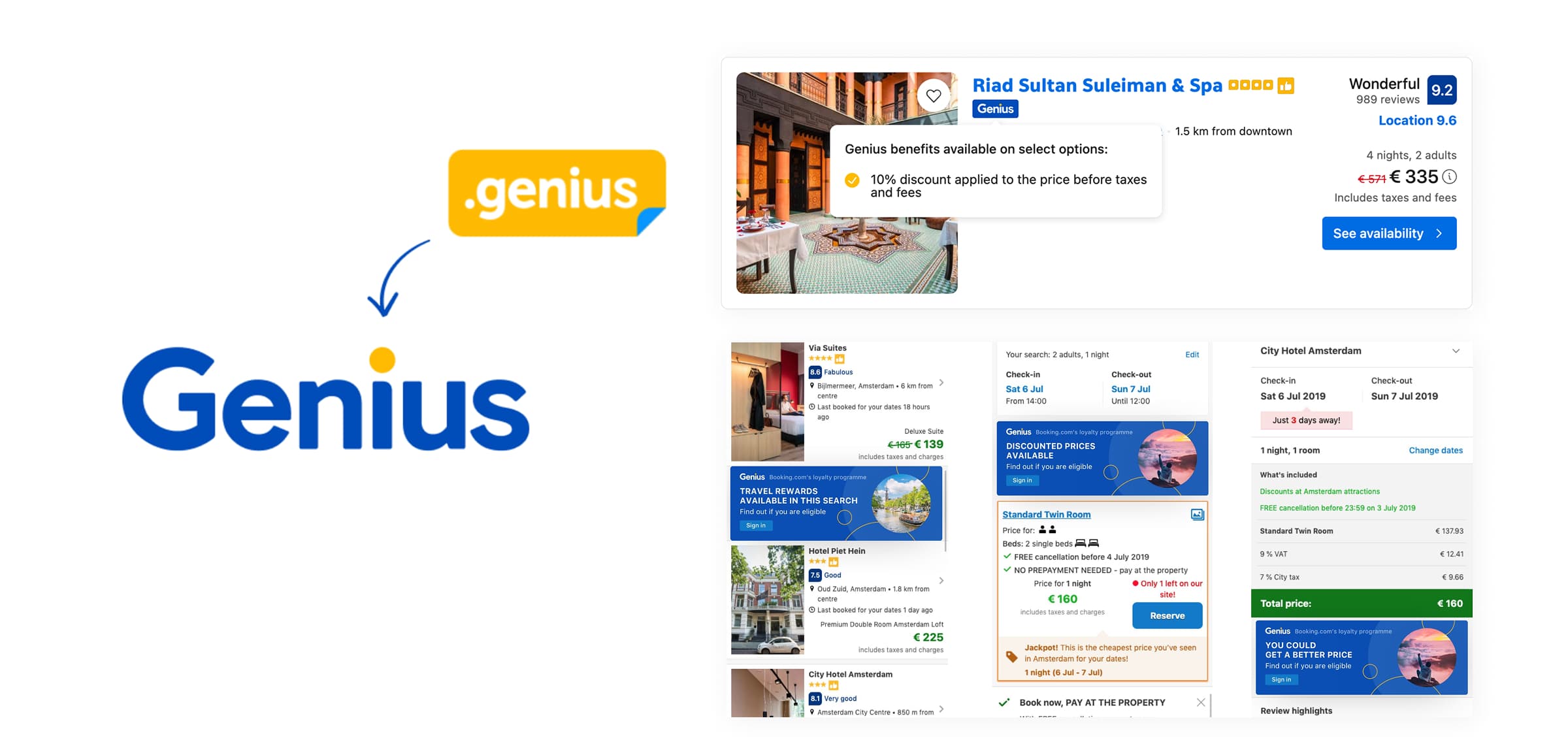
Principal designers had developed a new identity for Genius, Booking.com's loyalty program, to help it feel more mature and ready to scale. Our UX taskforce was brought in to extend that identity, both the visual language and the tone of voice, and make sure it actually worked across all the places users would encounter it.
Challenge
This came on the heels of the tiered program launch, which had been successful, so we needed to make sure that a refreshed identity didn't undermine the clarity and trust users had just started building with the new tiers. Users needed to still feel confident about their status and benefits, still understand how the program worked, and ideally feel even more engaged with it. Those things can easily pull in different directions when you're changing how something looks and sounds, so finding the right balance was the real challenge.
We had 4 months to validate and refine the identity across multiple touchpoints, from celebration moments to promotional messages to nudges, while also building a foundation that could support future growth. Research needed to be part of how we made decisions from the beginning.
My Role
As a Senior UX Designer, I stepped into the lead researcher role on a small UX taskforce over those 4 months, working closely with the project lead to make sure research wasn't treated as a last checkpoint but was part of how we discovered and designed throughout.
After the successful launch, I teamed up with our Senior Copywriter to document the complete identity in a microsite that became the source of truth for all teams working on Genius.
Approach
We started by designing research phases that would test messaging and design elements iteratively, beginning with paper prototypes in open labs and moving through full funnel prototypes to moderated sessions focused on specific moments. The idea was to build understanding gradually rather than trying to test everything at once.
One thing that made a real difference was testing elements in isolation before combining them into a complete identity. We started with tone of voice and visual elements separately, gauging initial reactions to each, which gave us much more precise feedback than if we'd presented the whole package at once. By the time we brought everything together, we'd already worked through the parts that weren't sitting well.
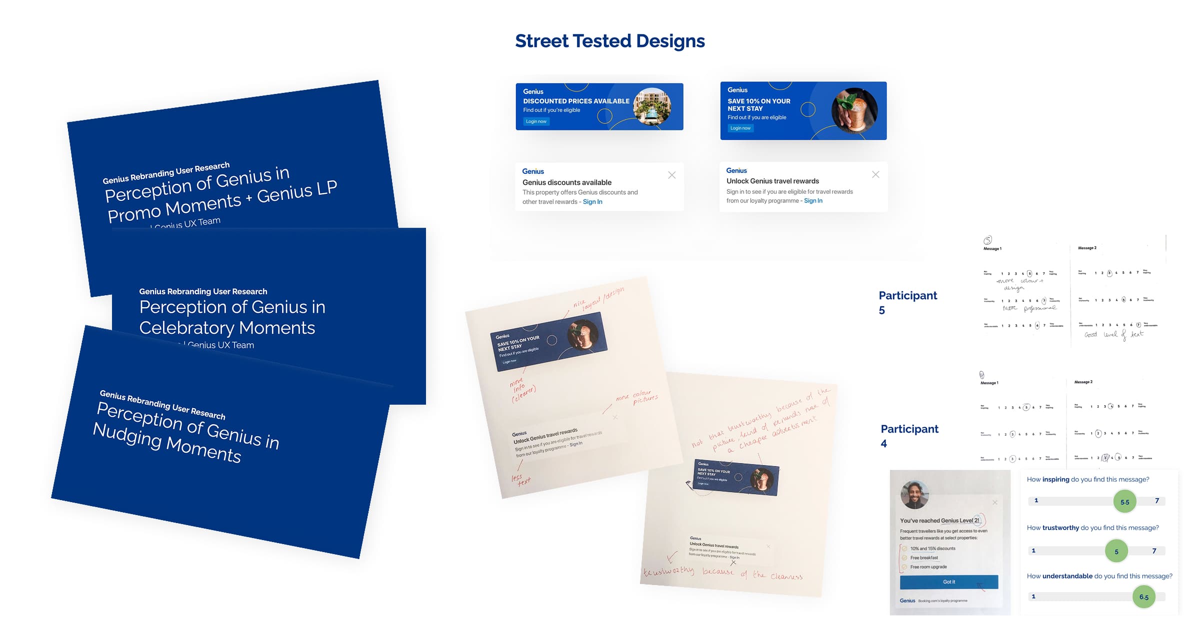
After each research phase, I consolidated findings into structured reports with goals, test structure, key takeaways, detailed findings per element, and all the testing artifacts. It ended up being one of the most valuable things we did for the project, even though it wasn't originally planned as a major deliverable. It helped us communicate clearly to stakeholders and built buy-in from leadership that made the rest of the project easier to move forward.
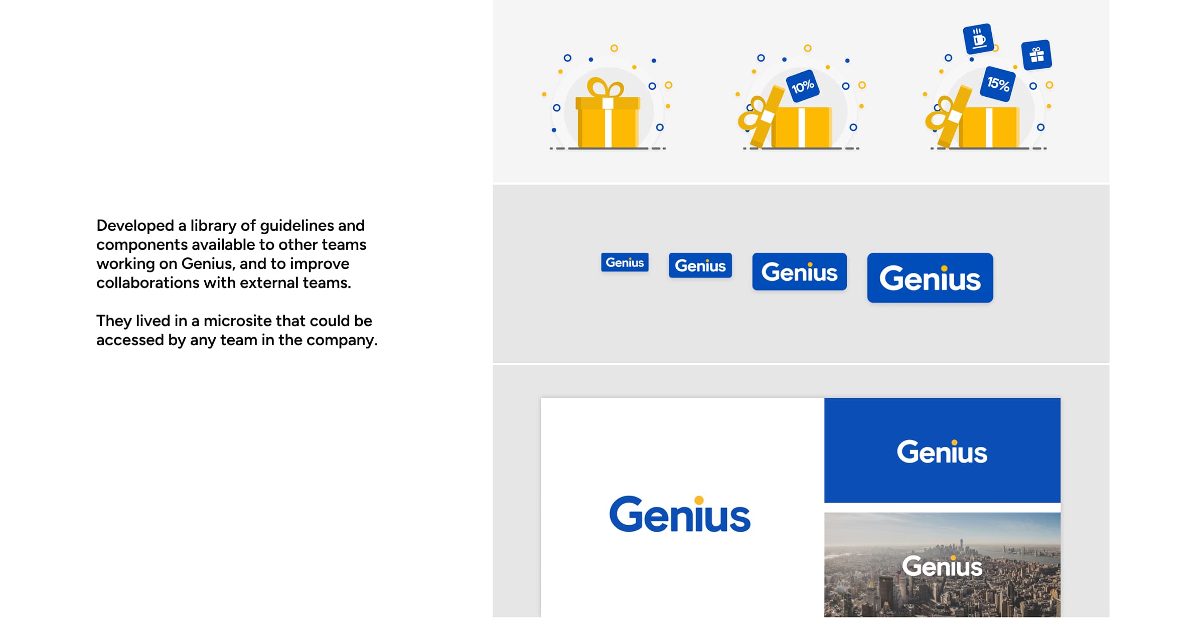
After launch, we created a living guidelines microsite, inspired by Shopify's approach of weaving context into every element rather than just listing rules. The result was that the guidelines were more readily understood and adopted across teams.
How I Contributed
I designed a research approach where we were testing tone, visuals, and messaging throughout discovery and design rather than saving it all for one large validation effort. This meant problems surfaced early, when we still had time to think through solutions thoughtfully instead of rushing fixes at the end.
Building stakeholder confidence was a big part of my role, and the structured reporting played a key part in that. By showing how research directly informed each decision, we were able to get buy-in from leadership who had initially been uncertain about the identity change. When people could see the reasoning and the evidence behind a direction, the whole dynamic shifted. It stopped being about personal preferences and became about what we'd actually learned from users.
And the documented guidelines became a source of truth that could be extended. The documentation we developed reduced onboarding time, improved collaboration with external teams, and gave everyone a shared language for how Genius should look and feel.
Key Questions
- How do we grow an identity without breaking user trust?
- How can research actively shape an identity, not just validate it?
- How do we help teams apply a new identity consistently at scale?
These questions guided our decisions throughout the project and helped us stay focused on what mattered most, even when there was pressure to move quickly.
Result
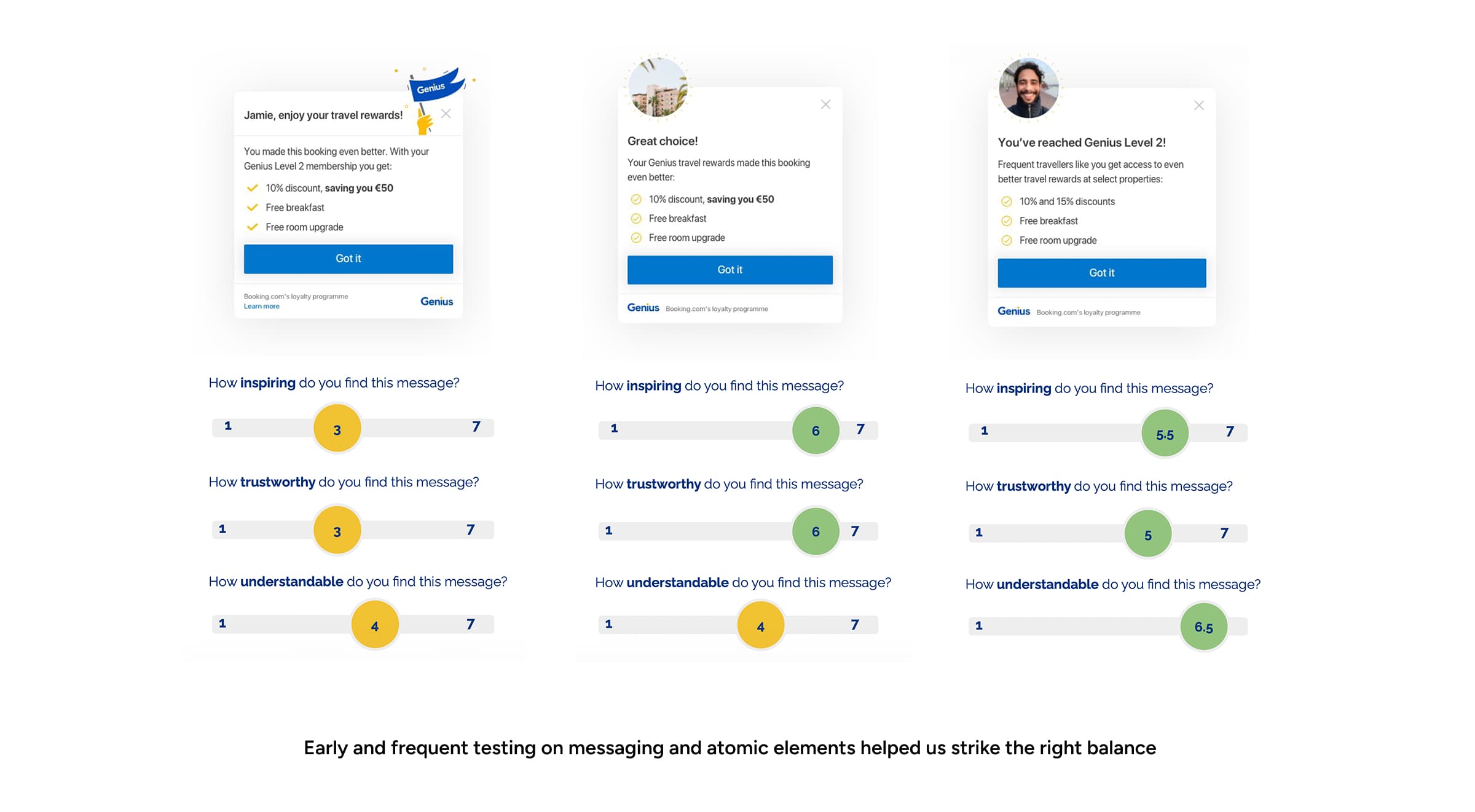
Because research was part of the process from the beginning, we were able to launch with a level of confidence that I don't think we would have had otherwise. The identity resonated with users across all the criteria we'd been testing against: trustworthiness, understandability, and inspiration.
Post-launch, the guidelines microsite saw over 140 people access and use it in the first 6 months. It was used to successfully design 3 campaigns outside our department, which saved significant time in kickoff meetings that had previously been spent explaining guidelines from scratch, and resulted in more consistent designs across teams.
What I'm most proud of, though, is that weaving research into the process from the beginning helped us find and solve problems earlier, launch sooner, and create an identity that was informed by our users.
Interested in working together? See how I can help.