Repositioning a Loyalty Program to Support Clarity, Progression, and Scale
Led UX strategy and design for the launch of a tiered loyalty program, helping users understand their status while creating a foundation for long-term growth.
At a Glance
- Timeline: 4 months
- Scope: UX strategy, design, and launch for Genius Levels. Transforming a static loyalty program into a tiered, dynamic system
- Role: Leading designer for web, partnering closely with Product Manager, Researcher, and Copywriters, and working with the app team to mirror experiences
- Key challenge: Help users immediately recognize and understand a more complex loyalty model without adding friction
Outcome
What I delivered:
A communication system and experience design that helped users understand where they stood in the new tiered program and how to progress, with a centralized information architecture and scalable messaging framework to support future program evolution.
Core deliverables:
- Value proposition canvas based on existing research to define launch strategy
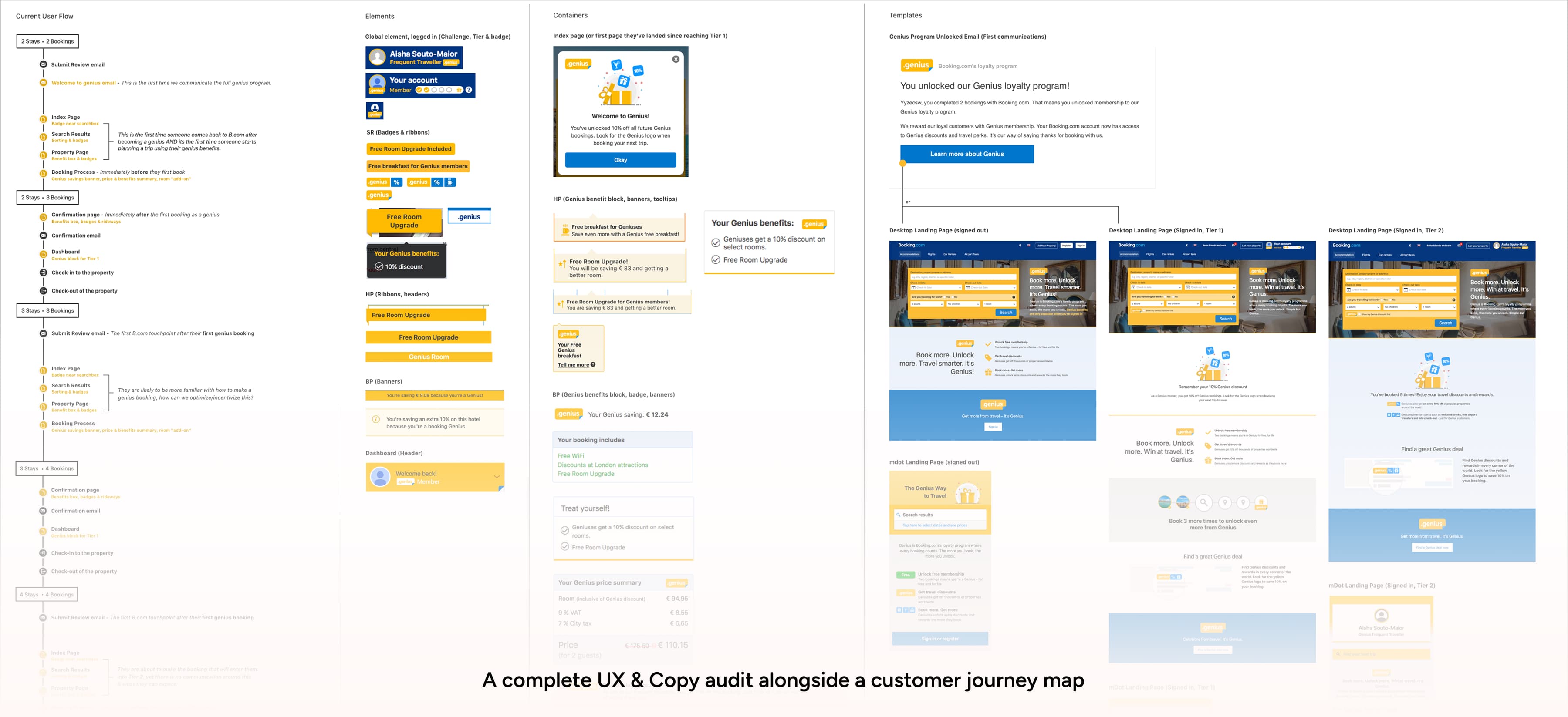
- UX and copy audit condensing research findings to position messaging, identify design patterns, and provide a foundation for our copywriter's strategy
- Reusable awareness cards showing personalized user status, level, and benefits
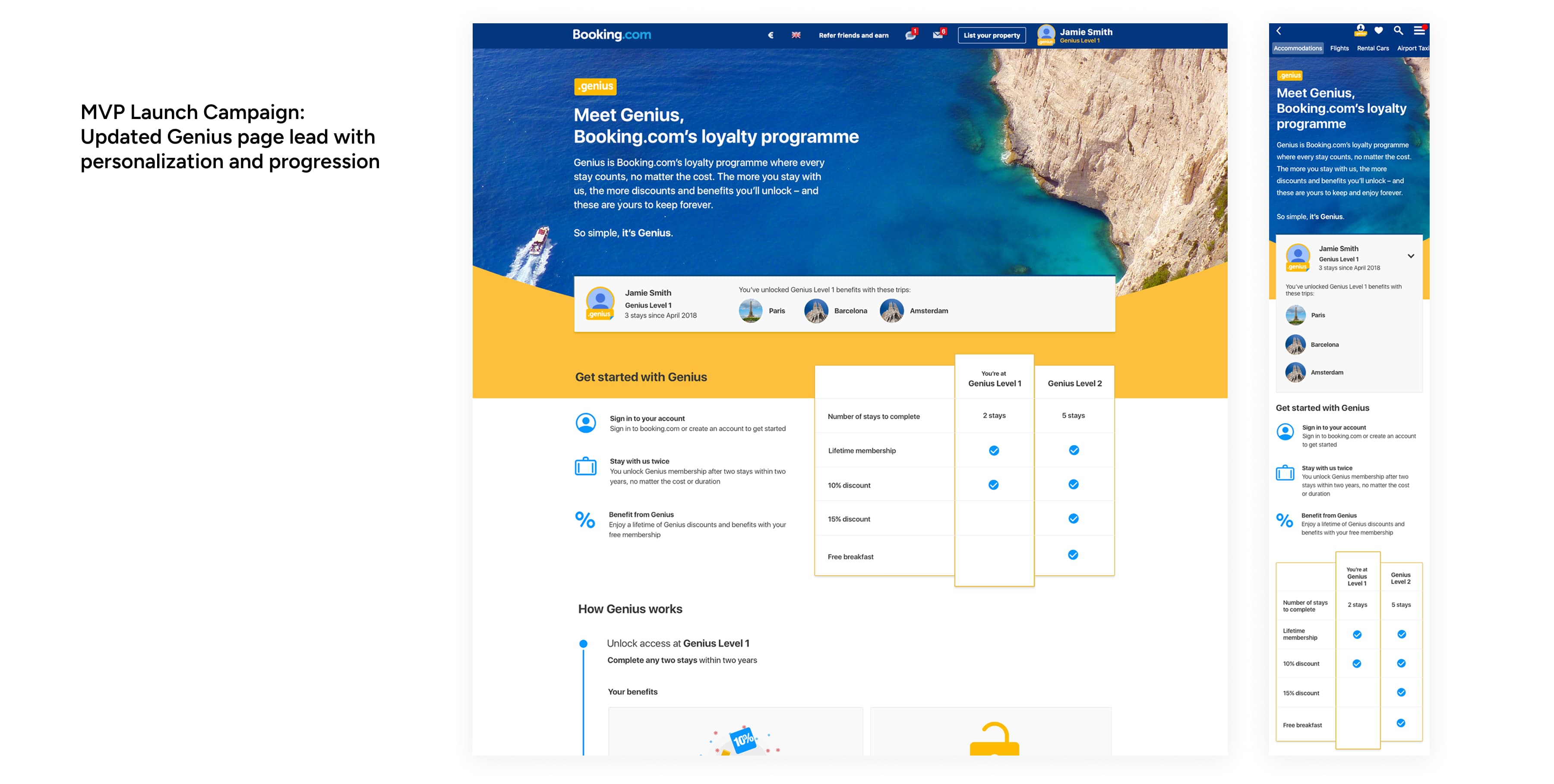
- Redesigned Genius page serving as single source of truth for program information
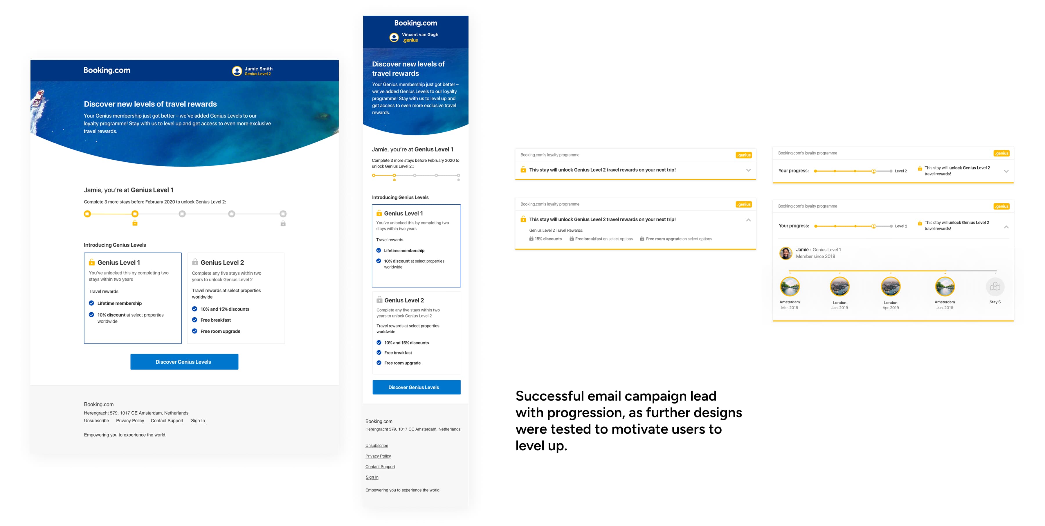
- Launch campaign including email and dismissable notifications tested thoroughly in a day of open labs in our research lab
Impact:
- A clear, tiered loyalty experience that users could understand at a glance
- A scalable communication system that could evolve beyond launch
- A shared foundation that aligned product, design, and research under tight deadlines
- A successful launch that supported continued investment in the program
Context
Genius, Booking.com's loyalty program, started as a static 10% discount with a handful of small perks. The business wanted to evolve it into a tiered, dynamic program that could support growth and give users a clearer picture of where they stood and what their loyalty earned them.
Challenge
The core problem: The shift from a flat discount to a multi-level program meant users would need to understand where they stood with Booking.com in a way they hadn't before. They needed to:
- Immediately recognize their status in the new tiered program
- Understand how progression worked without added friction
- See clear value in each tier so the change felt like a genuine reward
The constraints: On top of that, the experience had to work across surfaces, support future growth, and launch on a tight deadline.
My Role
I was the leading designer for web on this initiative, partnering closely with our Product Manager, Researcher, and Copywriters, and working with the app team to mirror experiences in a way that better fit their platform. My focus was on UX strategy, structure, and validation, and I relied heavily on aligning and collaborating early on to make sure we could move quickly.
Approach
Research-informed strategy. Together with my Product Manager, we created a value proposition canvas based on previous research to define our launch strategy and positioning for the tiered program.
Audit-driven design decisions. I condensed everything I had received from prior research into a UX and copy audit that helped us position messaging and understand the best design patterns to use. Beyond saving us from starting from scratch, it helped us identify messaging we needed to remove or replace so the experience felt streamlined and nothing conflicted with the new program structure.
User-led iteration. I set up user tests and an open lab with our researcher to validate and adjust the MVP so we were iterating on what we were seeing from users, not on what we assumed would work.
Centralized information architecture. Through the research and the UX audit, we saw a clear need to centralize all program information rather than scattering it across the funnel. I redesigned the Genius page to become a single source of truth, keeping communication light throughout the journey while giving users one place to understand the full program.
How I Contributed
Shaped launch strategy with my PM by creating a value proposition canvas that translated existing research into clear positioning for the tiered levels.
Designed an awareness flow informed by previous research. We already knew that loyalty program members want to quickly understand where they stand, and that personalized details with an overview of benefits helped increase recognition. So I designed reusable cards that displayed the user's signature, name, level, and a benefits overview, meant to be immediately recognizable and easy to scan.
Chose strategic placements for communication (homepage, profile, post-booking pages) based on where users would most naturally encounter and understand their status, led by user feedback on where these messages were most helpful.
Redesigned the Genius page with an information architecture that explained the entire program in a way that was easy to understand and absorb, with room for personalization.
Added a personalized profile block showing travel history and which trips unlocked the user's current level. This came directly from user feedback during testing, where people told us they wanted to see the program personalized to them and their travel history. It created a feeling of recognition and achievement.
Coordinated the launch campaign including a one-time email we tested thoroughly in a day of open labs in our research lab, along with dismissable notifications to reach users who might miss our standard messaging.
Key Questions
- How do we introduce a more complex loyalty model without adding friction?
- How can users immediately recognize their status and benefits?
- What information needs to be centralized versus distributed across the experience?
- How do we design something that can ship quickly and still scale over time?
These questions guided decisions throughout the project and helped the team stay focused under pressure.
Result
The launch was successful, with an increase in Genius bookings and more Level 1 users progressing to Level 2, which showed us that users understood the new structure and were using it the way we had hoped.
During campaign testing, the feedback was encouraging. Users said they felt engaged and inspired to rediscover the program, and several commented that they finally understood how it worked. The campaign also surfaced helpful feedback on how users understood progression, which gave us concrete direction for improving ongoing communication.
The centralized Genius page became the single source of truth for program information, which meant we could keep communication light throughout the funnel while still making sure users had what they needed when they wanted it. It gave us a foundation we could build on, and it reduced the pressure to over-explain at every touchpoint.
Interested in working together? See how I can help.